

Building a dashboard when the evidence said
the panel might already be enough
Mapping information needs, documenting risks, and testing a prototype with domain experts before committing to a new product surface.
ROLESr. Product Designer
TEAM1 PM, 2 developers
TIMELINE
2 months
Context
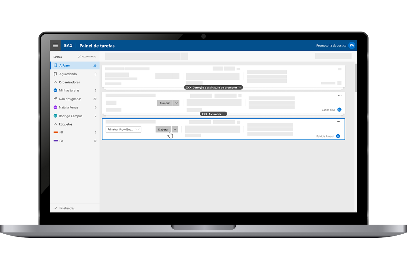
SAJ Ministérios Públicos is a Softplan system designed for case and procedure management within Brazilian Public Prosecutor's Offices (Ministérios Públicos). It centralizes all activities into a single platform, using automation to reduce bureaucratic tasks and increase productivity.
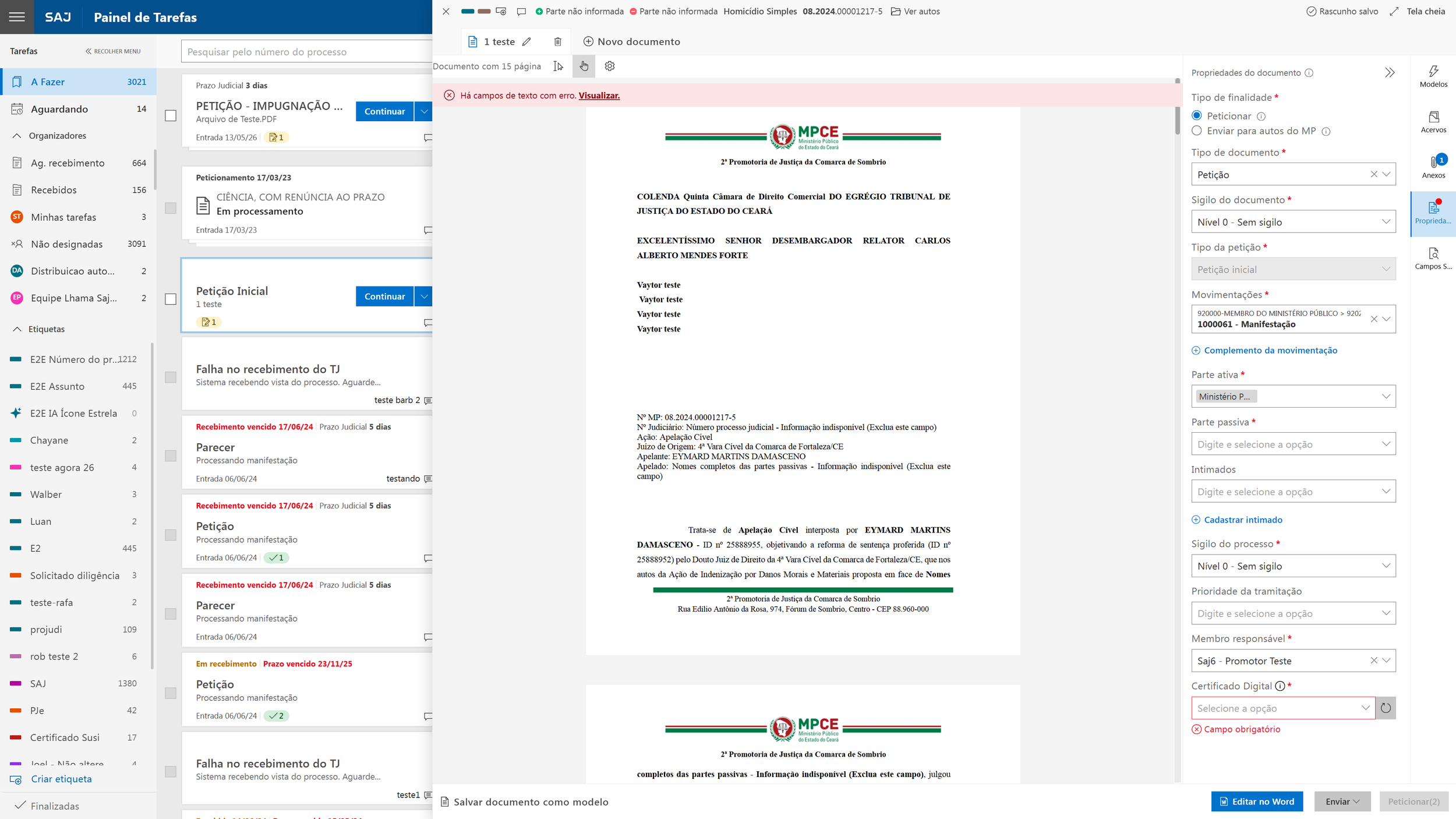
Key features include: deadline and notification tracking, task delegation, statistics and reporting, integration with justice courts (including electoral courts, SEEU, and PJe), digital case folders, AI-powered automatic recording and transcription of hearings, and automated publication in the Official Gazette.
The solution is web-based, meaning it works on any operating system or browser. Security is layered across four levels: passwords, profile-based access limits, digital signatures, and full traceability.
Design Approach
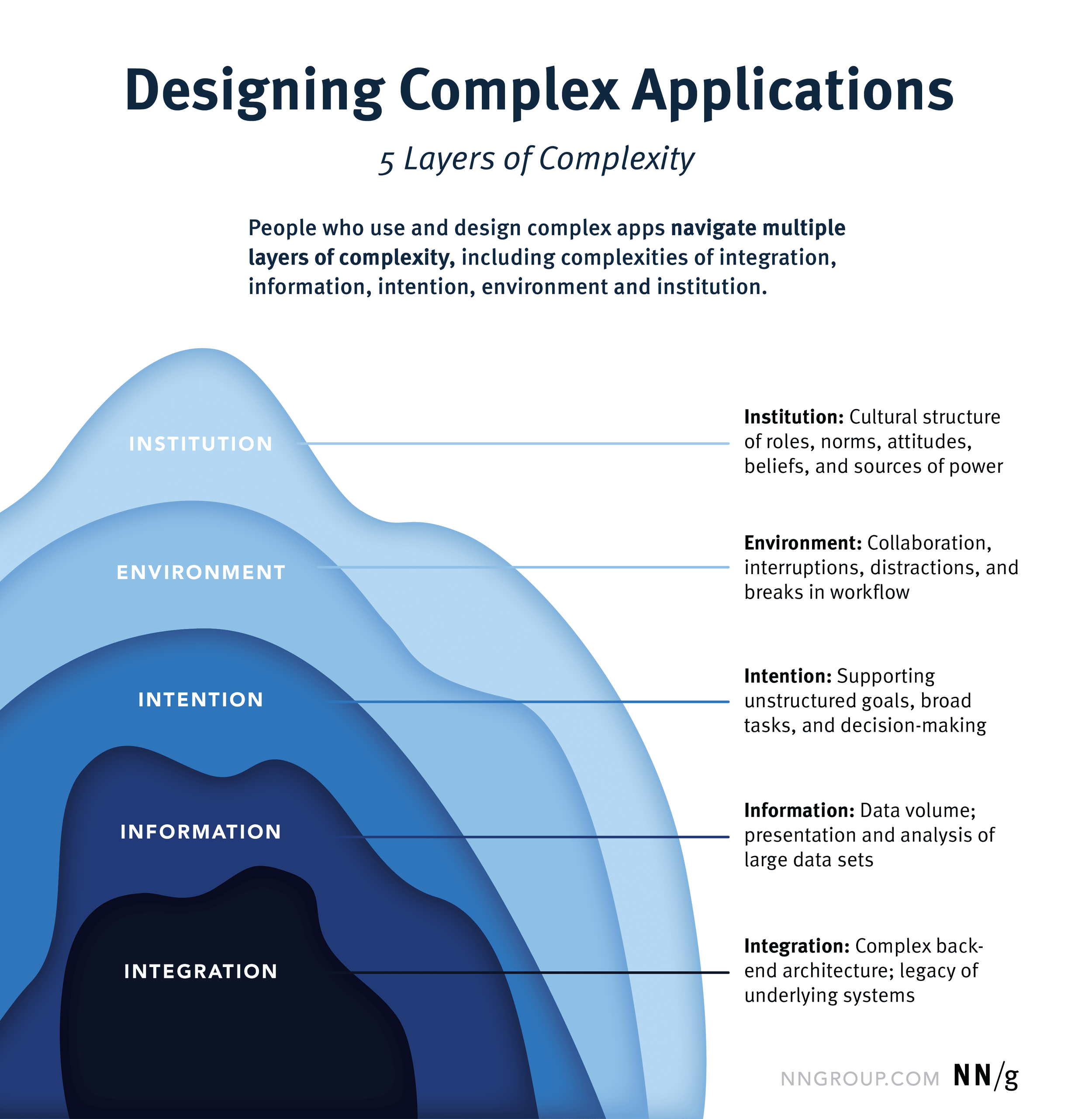
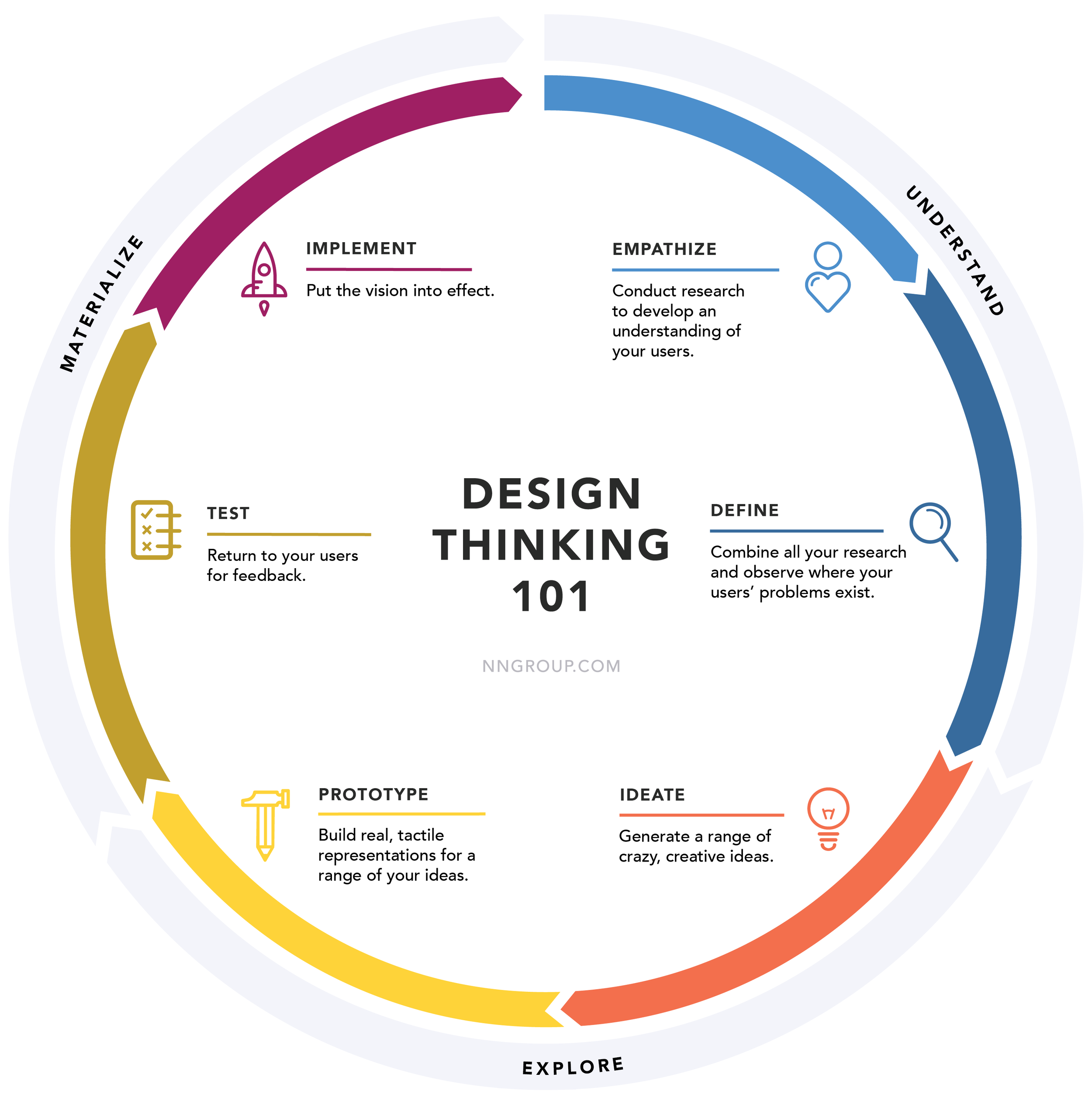
SAJ MP is not a complex application by accident. According to NNGroup's framework by Kate Kaplan, complexity in specialized-domain applications manifests across five layers: integration, information, intention, environment, and institution.
SAJ MP carries all five. It connects to multiple external court systems, like SEEU, PJe, and electoral courts. It handles large volumes of case data across distinct user roles. It supports workflows that are nonlinear and shaped by legal obligations, not by a path a designer can predict. It operates under deadline pressure, in institutional environments governed by procedural rules that predate any software decision.
That diagnosis shapes how I work.
In the Understand phase, studying the user is not enough. The work itself, how legal procedures flow, how decisions move between prosecutors, advisors, and clerks, has to be understood before any interface decision is made.
In the Explore phase, constraints are not obstacles. Legal compliance, data confidentiality, and mandatory system integrations define what a viable solution looks like. Co-creation with domain experts is how I pressure-test direction early.
In the Materialize phase, traditional usability testing falls short. The measure is not whether a user completes a task. It is whether the interface supports the reasoning behind a high-stakes procedural decision.
Problem
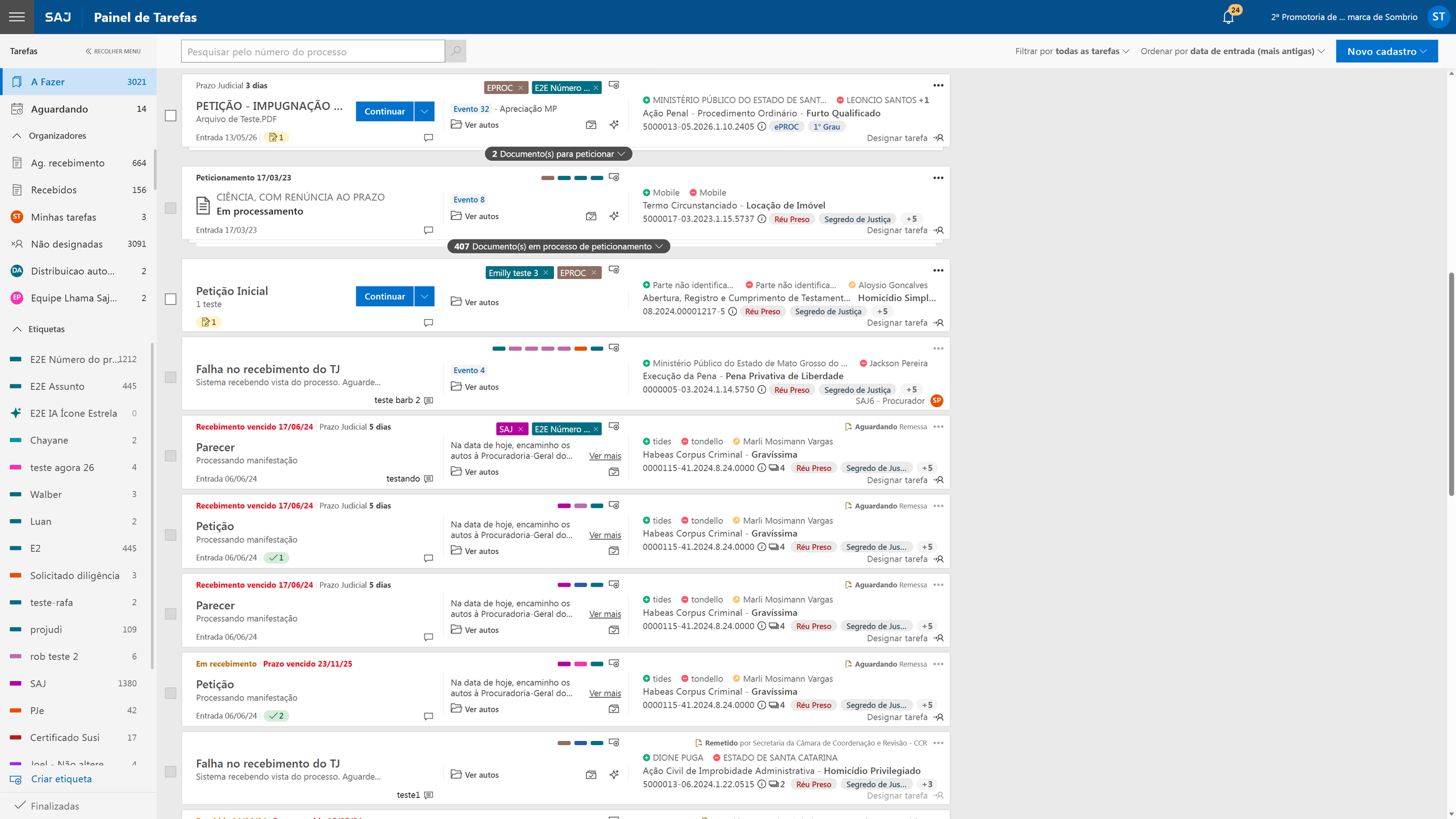
SAJ Online already had a panel that handled most operational needs: overdue deadlines, procedure counts, document queues. Before proposing a new surface, the team mapped user needs across extrajudicial, judicial, and shared contexts against what the panel already provided. The finding was direct: the gap wasn't missing data. It was missing orientation.
NO ORIENTATION ON LOGIN
Users opened SAJ Online and navigated manually to piece together their workload. The panel had the data, but it was just distributed across multiple sections with no consolidated entry point
THE PROTOTYPE HAD STRUCTURAL PROBLEMS
Before testing, the team documented 6 risks: unvalidated hypotheses, unclear user expectations, data availability gaps, and a fundamental question: Would the dashboard duplicate what the panel already did well?
The product vision document stated it explicitly: "We don’t have evidence supporting the need for an initial dashboard. The needs related to identifying critical issues and enabling quick action are being addressed directly within the panel." What was missing was a consolidated view of office status on login, plus structural questions the prototype still hadn't answered.
Voices from research
“I have to, in a way, go look for things. Go there to check what’s pending member review, what’s pending receipt.

“This is exactly what I need to know every day. It’s like reading my daily newspaper.”
Promoter · Civil prosecutor's office on seeing the prototype
“Judicial language needs to be removed.”
“Promote, revise, finalize, file. I don’t like the term ‘signature’”
Prosecutor · Appellate level on document queue labeling

What I changed
Two concept testing sessions with prosecutors from different contexts: a first-instance civil promotoria and an appellate-level procuradoria. Not usability tests. Domain experts correcting structural assumptions in real time.
BEFORE
“Expired Deadlines for Judicial / Extrajudicial”
Split deadlines by context, mixing two entirely different deadline logics in the same section.
“Documents for correction and signature”
The label implied the member’s role was simply to sign documents, overlooking the actual workflow involving review, editing, and filing.
Urgency section: domestic violence + incarcerated defendant
Legally mandated priority categories mentioned spontaneously by both users were missing.
Hearing schedule with no direct access
Prosecutors could see a hearing in the schedule, but still had to manually search the case file to find the hearing link sent by the court.
AFTER
“Deadline for Intimation Receipt (10 days) for Judicial only”
Extrajudicial was removed. The label now explicitly reflects the judicial intimation receipt window that actually defines this deadline.
“Cases in the member’s queue for correction and finalization”
Matches the real workflow sequence: the draft arrives, the member reviews it, edits it, and files it.
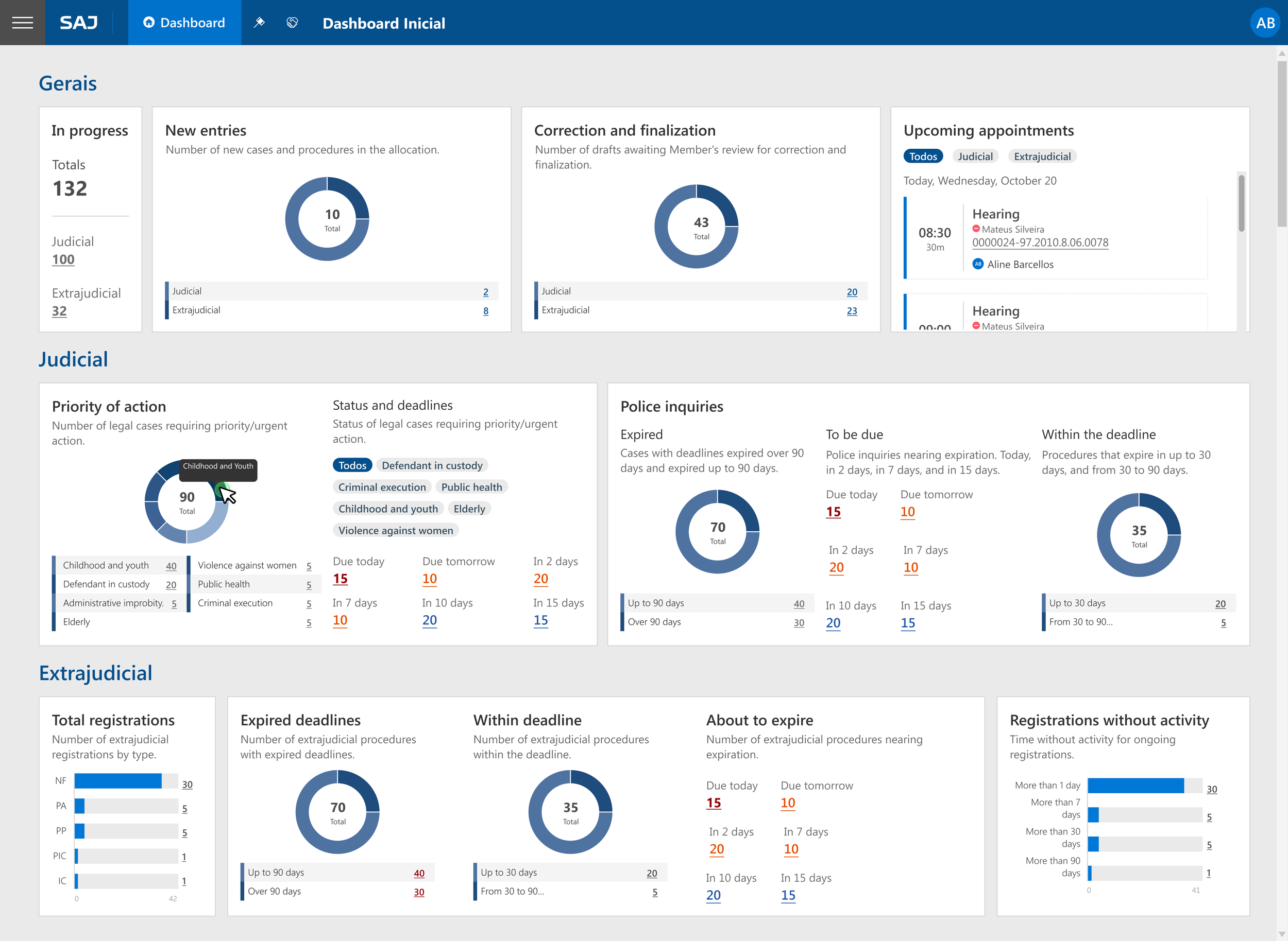
Added: child and youth matters, cases involving minors, cases involving elderly people, public health, administrative misconduct
Each category is grounded in a legal basis for priority handling, consistently confirmed across both sessions.
“Appointments schedule” with direct hearing URL
One click from the schedule directly into the hearing. Completely removes the need to search the case file for the hearing link.
The sessions also confirmed two structural decisions that shaped the final prototype: a standardized layout (no per-user personalization — team members need to reference the same view) and three distinct blocks separating Gerais, Judicial, and Extrajudicial indicators so each context's logic stays isolated.
What improved
Post-launch metrics
Number of navigation steps to reach the most urgent case after login
Time to first meaningful action after login
Adoption rate compared to SAJ 5 dashboard baseline
Key learnings
Starting from evidence changes what you build
The information mapping showed the panel already handled most needs. That made the case for a dashboard narrower and more precise: orientation on login, not operational data that was already accessible elsewhere.
Domain terminology is not a UX detail
When a label uses the wrong word, it makes the entire section functionally wrong for experts. The "assinatura" correction came from a user explaining her actual workflow, not from observing confusion with the interface.
Concept testing with domain experts corrects models, not just interactions
Usability testing reveals friction. Concept testing reveals whether the underlying model is correct. Both sessions corrected structural assumptions that no amount of interface iteration would have surfaced.